Video-graph

9 sept 2009

A fantastic way to visualize spatial patterns in time. This can not be done in the printed paper, but it can be introduced as a .gif file in the supplementary material.
Figure S1. Movie of historical defoliation caused by the Larch Budmoth, Zeiraphera diniana in the European Alps, 1961-1998. Inset graph shows the proportion of all areas that were defoliated in each year. Defoliation polygons were aggregated to form raster estimates of the proportion of 20 x 20 km grid cells that were defoliated. Bubbles are proportional to the amount of defoliation in each cell in each year. Visual inspection of the movie suggests the existence of repeated outbreak waves moving from west to east.

Reference Bjørnstad, O.N., Peltonen, M., Liebhold, A.M. & Baltensweiler, W. (2002) Waves of larch budmoth outbreaks in the European alps. Science 298: 1020-1023. (download pdf) (Supplement) (paper in Science website).
Related info: Ottar Nordal Bjørnstad webpage
Input idea courtesy of Pablo Almaraz

Read more...

Shaded confidence intervals

5 sept 2009

Confidence intervals are usually displayed as dashed lines around the main line. This often creates a messy graph, particularly when plotting more than one trend. The use of shaded areas shown here is an elegant alternative. This allows combining different information in the same graph (e.g. comparing model predictions with empirical data), and may be specially interesting when small (e.g. inset) panels are required. Note that an extension of this technique would be to use different gray intensities to display different confidence intervals around the same main trend.


Figure legend. Black lines correspond to field data, while the white line and the shaded area represent the median and the 90% credible intervals obtained from samples of the posterior distribution of selected models. 

Figure from a previous version of the ms. Martínez, I., Wiegand, T., Camarero, J.J., Batllori, E. & Gutiérrez, E. (2011) Disentangling the formation of contrasting tree-line physiognomies combining model selection and Bayesian parameterization for simulation models. American Naturalist 177: E136-E152. (link)

Input courtesy of Dr. Isabel Martínez Cano

Read more...

Table as inset


A powerful combination when space is a big constraint or when information on a table and a graph needs to be interpreted together.

Reference Diabaté et al. (2009) Spatial swarm segregation and reproductive isolation between the molecular forms of Anopheles gambiae. Proc. R. Soc. London B Published online before print September 4, 2009, doi: 10.1098/rspb.2009.1167. (download free pdf)


Read more...

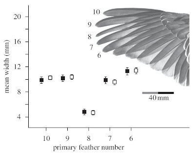
Illustrative photo

3 sept 2009

A good way of explaining at the same time the meaning of the x-axis, and  how the pattern shown in the graph looks like in the real world. Note that the lower feather width in primary 8 is easily appreciated in the picture.

Reference Hingee, M. and Magrath, R.D. 2009 Flights of fear: a mechanical wing whistle sounds the alarm in a flocking bird. Proceedings of the Royal Society of London B published online 2 September 2009 doi: 10.1098/rspb.2009.1110 (Journal website)


Read more...

Highlighting the trend within a cloud of points

23 ago 2009


Trends in scatter plot clouds could be difficult to appreciate. This is an intelligent way of showing the (mean) trend hidden within the messy cloud of points. The size of the black dots shows the sample size with which the mean was calculated. Note also the clever use of gray to give visual preference to the (more convincing) black dots.

Reference Webb, T.J., Gaston, K.J., Hannah, L. and Woodward, F.I. (2006) Coincident scales of forest feedback on climate and conservation in a diversity hot spot. Proceedings of the Royal Society B: Biological Sciences 273: 757-765. (download free pdf from journal website)


Read more...

On the use of error bars

21 ago 2009


This and other interesting figures and tables illustrate an informative paper by Cumming et al. on to use error bars in scientific plotting.

Reference: Cumming, G., Fidler, F. and Vaux, D.L. (2007) Error bars in experimental biology. The Journal of Cell Biology, 177: 7–11. (download pdf) (JCB website)


Read more...

Diagram with photo and graph

19 ago 2009

This figure is very interesting because it combines in a clear way information about study species, material and methods and results.

Reference Kozak HK, Graham CH and Wiens JJ (2008) Integrating GIS-based environmental data into evolutionary biology.Trends in Ecology and Evolution 23 (3): 141-148. (download pdf) (TREE website)

Read more...

Panels in front of a map

A clear way of showing plots in its spatial contexts without a waste of space. The light gray of the map precludes the compound graph to become messy. Note also the interesting small shaded histograms inside each panel.

Reference LaDeau SL, Kilpatrick AM & Marra PP. (2007) West Nile virus emergence and large-scale declines of North American bird populations. Nature 447:710-713. doi:10.1038/nature05829 (download pdf) (Nature webpage)


Read more...

Movement in 3D

This graph allows the visualization of animal movement in space (x, y) and time (z). Note that, in this way, trajectories of animals returning to same locations (e.g. showing homing behavior) do not overlap because the z axis.


Reference Cushman, S. A., Chase, M. and Griffin, C. 2005. Elephants in space and time. Oikos 109: 331-341. (download pdf) (IngentaConnect)


Read more...

Histograms in a scatter plot

18 ago 2009

An interesting way of visualizing the frequency distribution behind the mean  or other aggregated value displayed as a point in a scatter plot.

Reference Montoya, J.M & Solé, R.V. (2003) Topological properties of food webs: from real data to community assembly models. Oikos 102: 614–622. (download pdf) (IngentaConnect)


Read more...

  ©

Back to TOP  

Ir Arriba