Mostrando entradas con la etiqueta birds. Mostrar todas las entradas

Illustrative photo

3 sept 2009

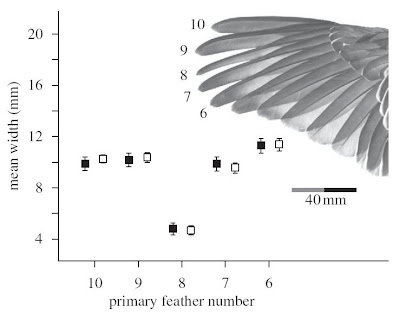
A good way of explaining at the same time the meaning of the x-axis, and  how the pattern shown in the graph looks like in the real world. Note that the lower feather width in primary 8 is easily appreciated in the picture.

Reference Hingee, M. and Magrath, R.D. 2009 Flights of fear: a mechanical wing whistle sounds the alarm in a flocking bird. Proceedings of the Royal Society of London B published online 2 September 2009 doi: 10.1098/rspb.2009.1110 (Journal website)



Read more...

Panels in front of a map

19 ago 2009

A clear way of showing plots in its spatial contexts without a waste of space. The light gray of the map precludes the compound graph to become messy. Note also the interesting small shaded histograms inside each panel.

Reference LaDeau SL, Kilpatrick AM & Marra PP. (2007) West Nile virus emergence and large-scale declines of North American bird populations. Nature 447:710-713. doi:10.1038/nature05829 (download pdf) (Nature webpage)


Read more...

  ©

Back to TOP  

Ir Arriba